Monday, October 18, 2010

The Victor Churcill Butcher - Sydney

In the food section of a creative and trendy website, you often see the review of a new restaurant or the cool café in town. But rarely, if not ever, you see a full interior design review of a butcher. This is the case in this article about the Victor Churcill Butcher in Sydney.

One of the window display in Victor Churcill Butcher

Interior of the butcher
The extraordinary design of this place clearly shown in this review (the link here). Through various pictures of  the interior and window displays, the article takes us on a short tour around the shop. This article is published in "Cool Hunter", the website known for its engaging visual information through quality photography in each of the article. This is the key factor that makes the article interesting.

The butcher review talks briefly about the history of the site and the company behind it, which is Vic’s Premium Quality Meat, the leading meat supplier to some of the finest restaurants in Australia, China and Singapore. It is also located in a well-established suburb.

With these facts it is easy for the readers to understand why the company choose to have a well designed shop. Considering the position of the company and teh history of the place, the article build the argument why the Vic’s Premium Quality Meat did this. They engaged Sydney-based Dreamtime Australia Design whose design many restaurant, bar and resort projects around the world.

I think this is the kind of review that will give an impact, because with a well-written article and engaging pictures, it can moves the readers to actually go there and experience the design by themselves.

Image sources:
One of the window display in Victor Churcill Butcher
http://www.thecoolhunter.net/images/butcher3(1).jpg
Interior of the butcher
http://www.thecoolhunter.net/images/butcher.jpg

Art & About Sydney 2010

In Sydney, there is at least a festival happening somewhere. One of the big festival being held across the city right now is art & about, an art across Sydney held in 23 September – 24 October. This article from Time Out Sydney was published in accordance to the launching of this festival.

Link of the article here.

This article serve like a guide to the festival because it suggested an itinerary to enjoy the festival and highlight few exhibitions that they think worth to be checked out. Fro example, it suggested the reader to start the festival tour with “Oh Alfred” installation.

It provides a link into the exhibition’s page that contains more detailed explanation and the map to show the location of the exhibition. This apply for every exhibitions it suggested. The article also gives a full list of exhibitions held in this festival.

"Oh Alfred" installation
It is a very informative article that gives the readers an overview of the festival and also gives them direction. As a service article, it works because it gives comprehensive information that people use straight away. However, if the readers want to know a more in-depth analysis of the exhibitions, what is the concept behind it or analysis about the art and installation,  they will not get it from this article.

Even though it is a complete article, I think it is still written like an advertising for art&about. It still looks like a media release from the festival. It will be good if it is written in a more interesting angle instead of presenting information about the exhibition.

Image sources:
art & about logo
http://www.timeoutsydney.com.au/pics/events/art-and-about.jpg
"Oh Alfred" installation
http://www.timeoutsydney.com.au/pics/events/oh-alfred.jpg

Sunday, October 17, 2010

The Power of Colour

Looking at any article in the coll hunter website is like a visual therapy. I am impressed by their big collection of images and how they present it as collages that enhance the article. This feature called “The Power of Colour” is no different (the link here). What better ways to explain colours than through visuals?

application of bright colours in various design elements

This article talks about how bright colour should not only seen as “primitive, wild, and frivolous, but can also represent elegance and widely used by top-tier designers and luxury brands. It is a very relevant article because this perception does exist in design world.

Through the images and examples ("just think of your favourite brand’s logo and you will most likely visualize some colour") they build a brief but strong argument about the power of bright colour.

The vocal point of the articles is the images rather than the writing. Words in this article are used to complement the images. Even if you look at the title and go through the images, without reading any of the writing, you can get the point that they are trying to convey. However the written part itself also have an important part to explain the images and the standpoint of the author about the power of colour. 

It will be better if somehow each picture can have caption that explains what building it is, so if people want to find more information or images base on the article, they can search it easily.

Image source:
application of bright colours in various design elements
http://www.thecoolhunter.net/images/colorr13.jpg

Sunday, October 3, 2010

Tromarama: hand-made video art


I came across this music video for the song “Zsa Zsa Zsu” from a group called RNRM (Rock N Roll Mafia) on my visit to Mori Art Museum, Tokyo, a couple weeks ago. It’s an uber-cool hand-made video art using 12 kilograms of buttons and a kilogram of beads to create 1500 frames for a 4 minutes 43 seconds video.


Screen shots from "Zsa Zsa Zsu"video
Check out the music video here

Turns out, this video art is a piece from Tromarama, a group of three artists from my home country Indonesia. Mori Art Museum in Tokyo held the exhibition of their work from July 24th through November 7th.

In their blog, Tromarama describe the music video as “a flood of color”.

“The steadily changing colors on the screen, red, pink, purple, green, and blue, have the effect of imbuing time and space with movement. The buzzing vibration generated by the subtle differences in the colors of the buttons and beads is a perfect match to R.N.R.M.'s danceable electronic sounds.”

Link for the article in Tromarama’ blog about “Zsa Zsa Zsu” here, under the part titled “Focusing on All Things Small”.

The article explains how Tromarama interpret the pop-dance music from RNRM and create a visual that compliment the music. Through this article the readers can understand what message meant to be delivered through the video art.   

The “Zsa Zsa Zsu” is not the only out-of-the-box music video that they have created. Another example is a video art for a song titled “Serigala Militia” from a metal band “Seringai”. This video used a series of carved woodblocks that filmed individually and put together to create an animation work.

Check out the Serigala Militia – Seringai” music video here.

Image sources:
screen shots from the "Zsa Zsa Zsu" music video
http://www.youtube.com/watch?v=pLlxIllNX1s

Leica M7 Hermes Edition

Leica M7 Hermes Edition out in two colours: Orange and Etoupe
As a camera brand, Leica is long known associated with collectible cameras, the kind that you buy not necessary to take good picture, but more as luxury goods. Right when we think Leica itself is prestigious, look who they collaborated with: Hermes, the high-fashion brands responsible for the famous birkin bag.

When these top two forces in their domain created a range of limited edition cameras, one thing is obvious: it will be crazy expensive. Super stylish, but crazy expensive. You can take this art piece home if you got 12,950 USD (13,350 AUD) in your pocket.
The Leica M7 Hermes Edition with complete kit 
Launched last December with only 200 (100 each colour) are being produced, this camera marks Hermes continuing collaboration with high-end brand from all fields. Hermes collaborated for the first time with Leica in 2003, producing the Leica MP Hermes edition. Another example is a collaboration with world fastest and most expensive car, BugattiVeyron. They launched the Bugatti Veyron Fbg par Hermes in 2008.

In that price tag, I start to wonder, what kind of picture worth taking with this Leica M7 Hermes edition? Well, according to one of the owner of the camera: none. He post in his blog:  

“You see, I am going to get a whole lot of crap of many Leica enthusiasts for saying this, but for me personally, this is an investment piece that will never see a roll of film. This camera will remain in its cozy silk-lined box until I get a worthy cabinet to display it in for a while, then it will go back to rest in its dark box.”

I guess this camera is really more of an art piece than a gadget.

Link of the full article here. 

Images sources:
The Leica M7 Hermes Edition with complete kit 
http://www.purseblog.com/hermes/leica-m7-hermes-edition.html
Leica M7 Hermes Edition out in two colours: Orange and Etoupe
http://www.blogcdn.com/www.engadget.com/media/2009/11/091117-leicam7-g01.jpg

Sunday, September 19, 2010

Drawing The Line

If you are into fashion, you will be familiar with the name Karl Langerfeld, Alexander McQueen, Miranda Kerr, or Marc Jacobs. However, if I say the name “David Downtown”, does it ring any bell? Only to some of you, I guess.

It is not because he is not a significant character in the fashion world, but because the media rarely talks about his profession (fashion illustrator), compared to designers, models, or photographers.
David Downtown is often called as “The World’s Greatest Fashion Illustrator” or “The Karl Langerfeld of Fashion Illustrator”. This article titled Drawing The Line by Lonna Edwards for The Age is a profile of Downtown.

The article talks about Downtown’s previous career path “from writing cookbooks to a sex manual”, about how he prefer not to be called “The World’s Greatest Fashion Illustrator” (‘‘who said that, anyway? My parents?''), about his career now as a fashion illustrator that has worked with fashion’s first class, and about the fashion illustrator role now, as photography take the central role in visualizing the fashion world.

In this era when illustration is not used as much as before (for advertising, magazine cover, etc.), Downtown sees the profession becoming more artisans. He said that, “The more photography dominates, the more special drawing becomes.''

The problem of this David Downtown’s profile is in the lead of the article. It starts with the plus-sized models as a short trend and how Downtown does not really keen on the issue (''Models have always been taller, thinner, younger and more beautiful than us. They are genetic accidents.'').
This lead then being related to Downtown’s works that also experiences the same ruthless fashion cycle. Still, it feels like a distant comparison that does not cohere with the story.

However, the article as a whole communicates a general idea about how fashion illustration is, through one of the great mind in it.

iPod to iWatch

Apple has made another geek dream come true.  On September 1, the new iPod nano that now has a multitouch screen was presented for the first time. Steve Jobs started the buzz about how this iPod nano can be used as a watch, and of course, as soon as the product available in the market, Apple enthusiasts responded to this idea.

Kei Ogikubo's Version of iWatch
Kei Ogikubo posted in his flickr page the first photo of how the iPod nano can be use as a watch. This picture had a big impact, as it marked the beginning of the iWatch trend. Ever since, companies have been selling their own pitch, different kinds of wristband that can transform the iPod nano into an iWatch.

The Sydney Morning Herald noticed the issue and published this short article. It shows a company called iLoveHandles that instantly react to this iWatch craze. They produce the rock band straps, which is a simple wristband on affordable price. The iPod nano can be clipped in to the wristband and be used as a wristwatch. The article gave a succinct review about the product that useful to readers.

Another article covers Incipio Technologies, Inc. that has officially become the first case maker for iPod nano. It basically also explained about the product, what is it made of and the variety they have.

This two article is purely informational, so they are written in a hard news style. The news hook (as iWatch is the talk of the moment) is already a main attraction to the intended reader so they just have to focus in product information for consumer instead of crafting the paragraphs and sentences.

Related to the content, it will be interesting to see if apple jump in this iWatch wagon and work with some company to produce the “official” iWatch.

Image Source:
http://a.fsdn.com/gc/wp-content/uploads/2010/09/iWatch-Kei-Ogikubo-001-580x386.jpg

Saturday, August 21, 2010

How Small Are Yours ?

The Dwelle.ing prefab house (253 sq. feet/23.5 sq. m)


The interior of the Dwelle.ing house
Simple living, reduced economy access, and a desire to live an eco friendly lifestyle directs the house trend in these past few years towards small (even tiny) houses, with good design of course.

This article Dwelle’s Super Minimalist Prefabs Make Small Living Swell showcases a recent small house design made from a UK-based micro buildings designer.

These houses called Dwelle.ing are made from prefabricated (material manufactured in standard sections that can be easily shipped and assembled) and eco friendly material.

Yuka Yoneda wrote this article for inhabitat, a blog about sustainable design. Looking from the responses through social media (273 facebook likes and 57 retweet), this article generates quite a lot of attention among the blog readers.

Compare to the other article about the same subject (Dwelle.ing) in TinyHouseBlog, this article in inhabitat have more news hook and presented in the more succinct and appealing structure.

The Dwelle.ing article in inhabitat is more interesting because it is started with the most important fact: tiny footprint (the bigger one is only 253 sq. feet/23.5 sq. m). Then it continues with the next interesting fact: sustainable features such as insulation made from 100% recycled newspapers, double glazed windows and the ability to achieve zero-carbon status.

Not only the way it presented that makes it engages the readers, but also more than that is because the content of the article is thought provoking. Because it can develop a discussion among readers whether the space in this house in an appropriate living space for a person.

Image source(s): 
http://inhabitat.com/wp-content/blogs.dir/1/files/2010/08/dwelle-prefab-dwelleings-13.jpg
http://inhabitat.com/wp-content/blogs.dir/1/files/2010/08/dwelle-prefab-dwelleings-12.jpg

Tuesday, August 17, 2010

The Cell, Just A Bouncy Room? Or More?

How can a design connect with its appreciators?

Sydney Design 2010 try to answer this question through this year’s theme “tell us a story”.

Held in 31 July – 15 August, it’s a festival that incorporated more than 70 events in 25 venues. Some of the exhibitions have a fun yet thought-provoking feel, a good way to stimulate new ideas.

Through a series of vlog (video blog), creator of thedesignvlog.com Emma Elizabeth covers the excitement awaits in Sydney Design.

This vlog here is about one of the highlight in Sydney Design. In this vlog Emma Elizabeth interviews Brook Andrews about his installation shown in Sherman Contemporary Art Gallery that titled “The Cell”.

It’s a inflatable bouncy installation painted with traditional indigenous pattern. To experience the installation, the bouncers use a pattern jump suit provided, a crawl in a narrow tunnel and end up in a big bouncy room.

It supposed to be chill out room, a place that disconnect from the outside environment and think about complex issue such as intercultural, indigenous, asylum, or death.

The question is, will people who get inside and experience the installation caught up in the bouncing, relaxing, and laughing in the pattern custome? Or can they actually go beyond the fun part and fulfill the purpose of the installation to contemplate about those issues?

The use of video as a medium rather than writing in this case makes it easier for the audience to understand the shape, colour, and rooms in the installation, and how you can go inside it. It is simpler to describe a room through visual than verbal.


Image source: 
http://webservices.cofa.unsw.edu.au/system/landscape_images/96/resized/TheCell.jpg

Tuesday, August 3, 2010

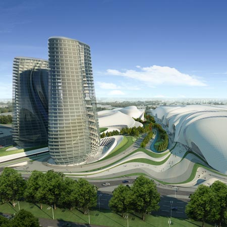
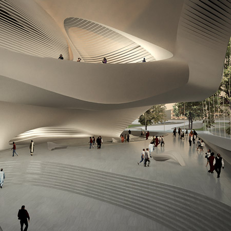
Zaha Hadid's Curvaceous & Visionary ARTchitecture

Dubai Opera House, Dubai, United Arab Emirates
Guggenheim Hermitage Museum,Vilnius, Lithuania
Cairo Expo City, Cairo, Egypt
King Abdullah II House of Culture & Art, Amman, Jordan
What do you think when you first see these buildings?

For me it’s highly futuristic, fluid, organic, sculptural, and I can’t imagine the complex structure they use to build those. These are some of the architecture works of Zaha Hadid, one of the most prominent and visionary architects in our era.

Architect is a profession dominated by men. The I-wannabe-like-him list in architecture world is a long one. It’s filled by legends such as Frank Llyod Wright, Le Corbusier, Frank Gehry, Tadao Ando, Santiago Calatrava, and I can continue it for another hundred words. 

Before Zaha Hadid, I don’t think the I-wannabe-like-her list in architecture was even exist. She conveys womanliness in her design. When you see a building, you’ll know if it’s her work.

Some of her designs are too complicated to be built that they still sit in her office, waiting for the building technology to catch up to her.

Time magazine finally recognised her brilliance and included her in the list of 100 Most Influential People in The World.

To check out the article, click here.

Written by her fellow (fashion) designer Donna Karan, famous for the DKNY brand, this article briefly explains Karan’s personal experience with Hadid and also with Hadid’s design. It’s an interesting and in a way credible point of view, since Karan’s artistic sense as a designer is also undoubted. 

She captured Hadid in an engaging way through description such as “Her work is light and lyrical, like an Asian artisan's brushstroke captured forever in the environment”.

Different from most of the article about Hadid that usually start with list her awards and achievement, or mention the list of fashion label that have collaborated with her, this article offers something that not so may people have with Hadid: personal experience of having conversation and working together with her.

Written in a highly visual language, this article introduces Zaha Hadid to the readers from other field of knowledge, not only the design field.

Image sources:
Dubai Opera House, Dubai, United Arab Emirates: http://www.worldarab.net/sites/default/files/images/dubai-opera-house_sq_0.jpg
Guggenheim Hermitage Museum,Vilnius, Lithuania: http://www.tuvie.com/wp-content/uploads/guggenheim-hermitage-miseum-by-zaha-hadid3.jpg
Cairo Expo City, Cairo, Egypt: http://static.dezeen.com/uploads/2009/06/zha_cairo-expo-city_03_sq.jpg
King Abdullah II House of Culture & Art, Amman, Jordan: http://static.dezeen.com/uploads/2010/02/dzn_sq_King-Abdullah-II-House-of-Culture-Art_Lobby01.jpg